Logo Analyzation & Review
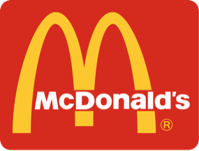
McDonald's Logo
Pros:
Cons:
Pros:
- Very Simple Design
- Easily Recognizable at Any Size & Color
Cons:
- Too Basic & Bland
- Unattractive Design
- Poor Use of Color (IMO)
- Doesn't Show What the Company Does/Sells

KFC Logo
Pros:
Cons:
Pros:
- Unique, Attractive Design
- Recognizable with Any Colors
- Displays Company's Founder
Cons:
- Too Complex Design
- Unrecognizable at Certain (Small) Sizes
- Doesn't Show What the Company Does/Sells
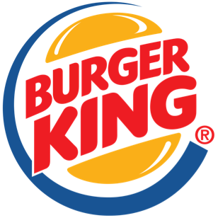
Burger King Logo
Pros:
Cons:
Pros:
- Simple & Unique Design
- Nice Use of Color
- Shows the Company's Speciality
- Recognizable at Any Size
Cons:
- Too Large Text, Is Unattractive
- Cartoonish Design Aspects
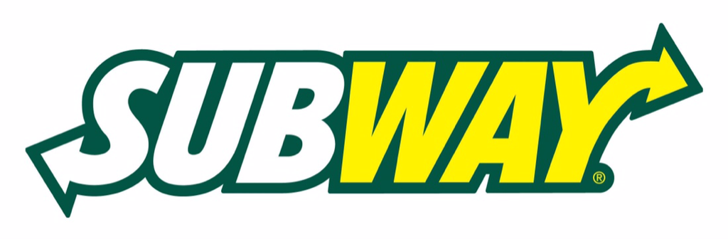
Subway Logo
Pros:
Cons:
Pros:
- Easily Recognizable
- Easy to Read
- Clear Use of Color
Cons:
- Lazy Design, Only Composed of Text
- Won't Fit Within Square Spaces
- Doesn't Display Company's Products

Pizza Hut Logo
Pros:
Cons:
Pros:
- Simple Design
- Easy to Recognize from Any Size
- Nice Use of Color
Cons:
- Unoriginal, Lazy Design
- Spreads Wrong Message about the Company
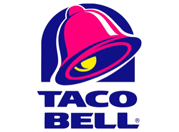
Taco Bell Logo
Pros:
Cons:
Pros:
- Simple, Unique Design
- Easily Recognizable, and at Any Size
Cons:
- Poor Color Contrast
